
by NelsonCorp | Sep 19, 2025 | Chart of the Week
Well, it didn’t come as a surprise, but the Fed went ahead and cut rates this week—their first move since last December. What was more interesting, though, were the new economic projections. This week’s chart shows the Fed’s outlook for 2025. The bars track...
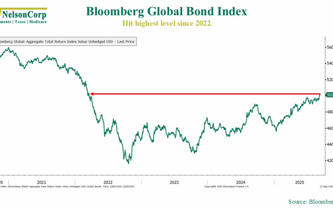
by NelsonCorp | Sep 12, 2025 | Chart of the Week
Are bonds back? They’re certainly looking feisty again. As this week’s chart above shows, the Bloomberg GlobalAgg Index, which tracks returns on sovereign and corporate debt across developed and emerging markets, has surged more than 20% from its 2022 low—and...
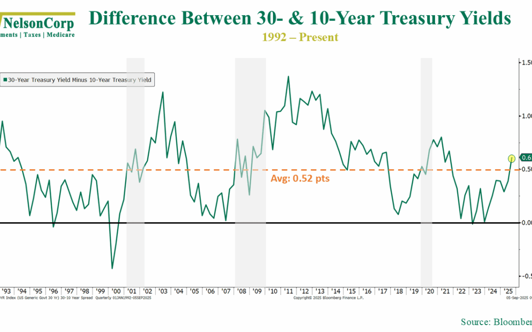
by NelsonCorp | Sep 5, 2025 | Chart of the Week
There’s been a bit of chatter lately about 30-year Treasury yields and the fact that they have been inching up towards 5%. As a reminder, the 30-year Treasury yield is the interest the U.S. government promises to pay you each year if you let them borrow your...
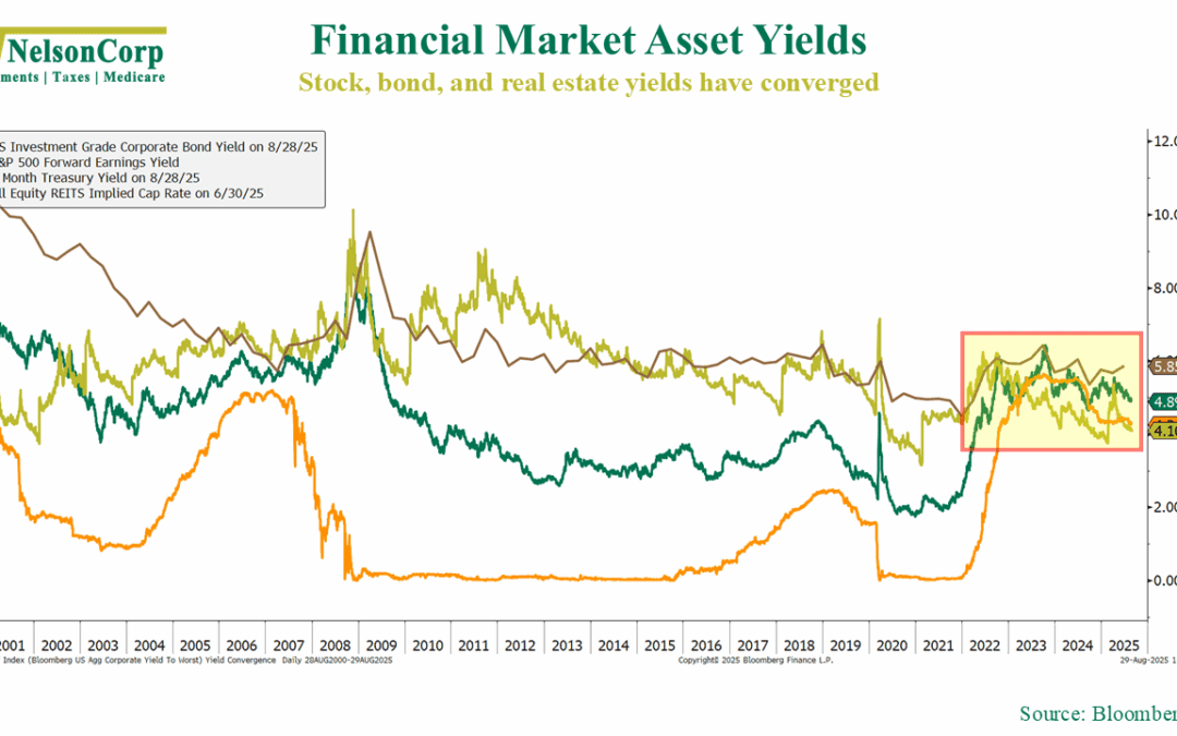
by NelsonCorp | Aug 29, 2025 | Chart of the Week
Something a bit unusual is happening in financial markets right now. The income, or “yield,” you can earn from stocks, bonds, and even real estate (REITs) has all started to look the same. That doesn’t happen very often. This week’s chart shows what I mean....
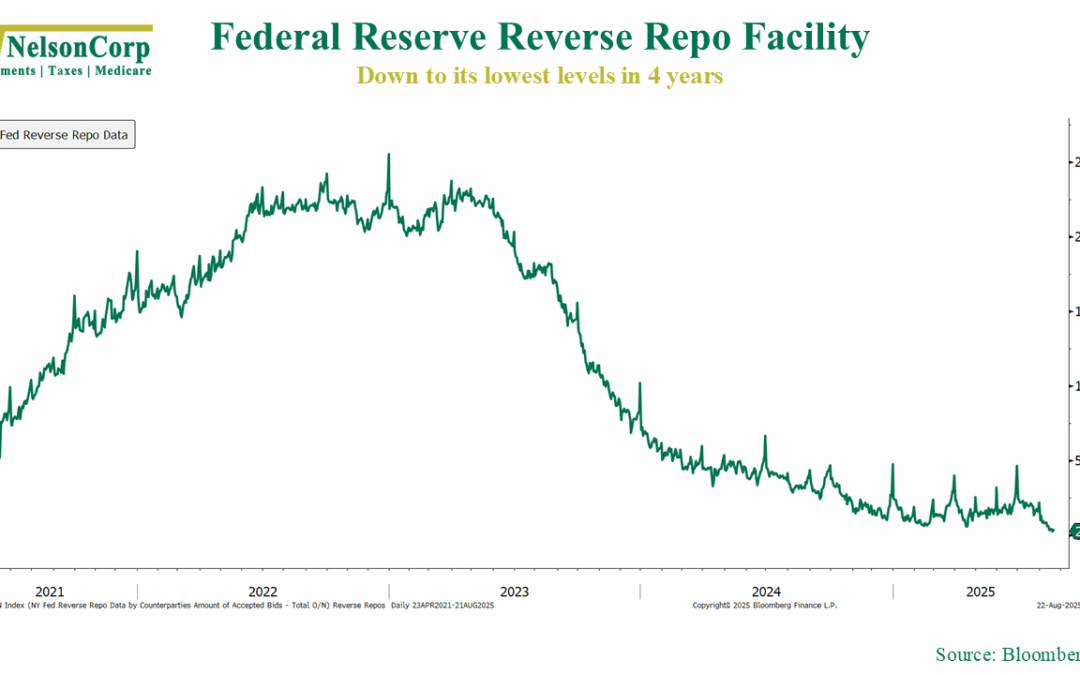
by NelsonCorp | Aug 22, 2025 | Chart of the Week
There’s an interesting development happening in financial markets right now. Sure, it’s a little boring and technical, but it centers on something called the Reverse Repo Facility. I like to think of it as financial markets’ version of coins in the couch...
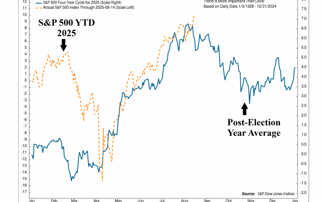
by NelsonCorp | Aug 15, 2025 | Chart of the Week
Despite all the headlines and big-picture drama this year, the stock market has been quietly following the historical, seasonal playbook pretty closely. As this week’s chart shows, the S&P 500’s path in 2025 has lined up closely with what typically happens...