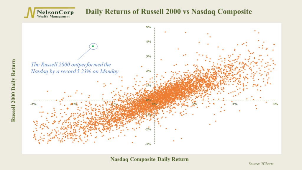
This week’s featured chart is a scatterplot of the daily returns of the Russell 2000 Index versus the Nasdaq Composite.
These are two very different measures of the stock market. The Russell 2000 Index is comprised of the 2,000 smallest companies in the United States, whereas the Nasdaq Composite contains the large technology companies that have dominated all year.
The Nasdaq’s returns are plotted on the horizontal axis, while the Russell 2000’s returns are on the vertical axis. Each dot represents where the two returns intersected for that day.
Generally, the returns are correlated. The dots on the graph cluster from the bottom left to the top right in roughly a straight line. In other words, when the Nasdaq has a positive return, so does the Russell 2000 and vice versa.
However, a change of pace happened on Monday. The Russell 2000 gained 3.7% while the Nasdaq fell 1.53%. This 5.23% outperformance was the largest on record, leaving that little green dot in no man’s land on the chart (the top left quadrant).
That was a dramatic move. However, whether this turns into a true rotation out of Big Tech and into these smaller, more domestically orientated companies remains to be seen.
This is intended for informational purposes only and should not be used as the primary basis for an investment decision. Consult an advisor for your personal situation.
Indices mentioned are unmanaged, do not incur fees, and cannot be invested into directly.
Past performance does not guarantee future results.