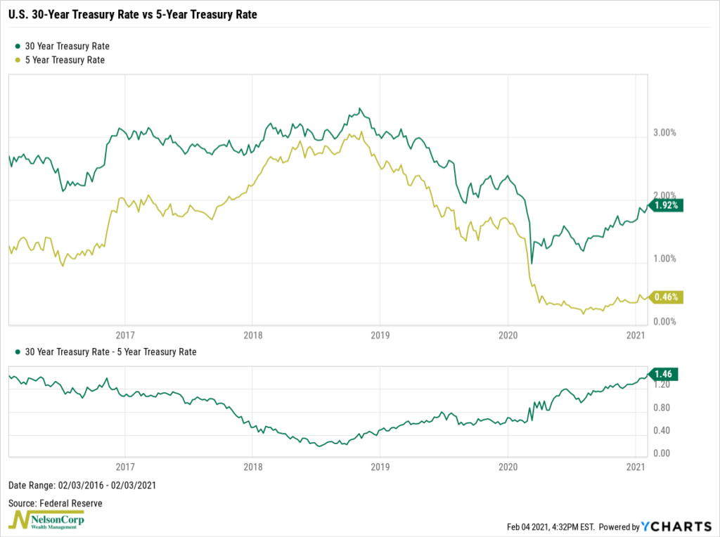
For this week’s featured chart, we look at a widely watched segment of the U.S. Treasury yield curve: the gap between the 30- and 5-year Treasury rates. The top half of the chart shows both the 30-year Treasury bond rate and the 5-year Treasury note rate. Underneath, we simply subtracted the 5-year rate from the 30-year rate to see how the spread between the two has changed over time.
Interestingly, we see that the yield curve has been steepening (i.e., the spread has been getting larger) since mid-2018. At around 146 basis points, the spread is now the highest it has been since early 2016.
The primary driver of this has been the sell-off in longer-dated Treasury debt. Although yields on both short- and long-term debt started declining near the end of 2018, the shorter 5-year debt fell more than the longer 30-year debt. And ever since rates bottomed back in March, the 30-year Treasury rate has risen nearly 90 basis points while the 5-year Treasury rate has remained about the same.
Since the Federal Reserve controls short-term interest rates, we will likely see long-term rates continue to rise—due to higher growth prospects and inflation—while short-term rates remain steady. This environment would likely favor stocks and short- to intermediate-term dated bonds. In contrast, long-dated bonds would suffer capital losses due to their higher duration (i.e., their sensitivity to rising interest rates).
This is intended for informational purposes only and should not be used as the primary basis for an investment decision. Consult an advisor for your personal situation.
Indices mentioned are unmanaged, do not incur fees, and cannot be invested into directly.
Past performance does not guarantee future results.