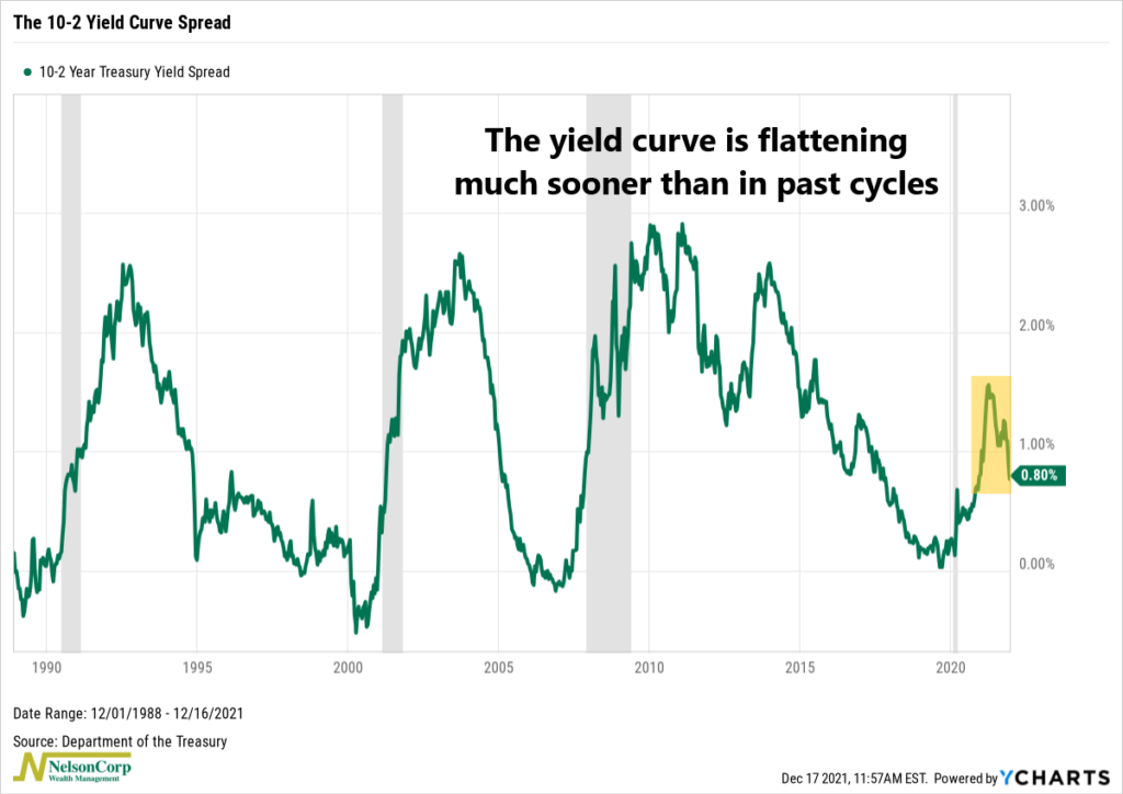
This week the Federal Reserve announced their intent to dial back bond purchases and perhaps raise rates up to three times next year. What’s weird, though, is that this is happening at a time when the yield curve is as flat as it is.
The chart above shows the difference between the 10-year and 2-year Treasury bond yields, aka the yield curve spread. When the line is rising (steepening), it means the longer-term 10-year yield is getting higher relative to the shorter-term 2-year yield. But when it is falling, it means the curve is getting flatter; in other words, the yields are getting closer together.
That’s what’s been happening recently, and it’s a bit odd because it’s a divergence from what we’ve seen play out in this past.
Coming out of the last three recessions (shown by the dark shading on the graph), the 10-2 yield curve spread widened to well over 2% before reversing course and heading lower.
But this cycle looks different. The 10-2 yield curve spread peaked around 1.6% earlier this year and is now flattening. It’s unusual for the Fed to start tightening monetary policy with the yield curve as flat as it is, and it’s worth paying attention to because it means less flexibility for the Fed going forward.
This is intended for informational purposes only and should not be used as the primary basis for an investment decision. Consult an advisor for your personal situation.
Indices mentioned are unmanaged, do not incur fees, and cannot be invested into directly.
Past performance does not guarantee future results.