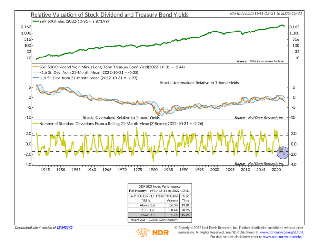
For this week’s indicator, we feature a chart showing the relative valuation of stock dividends and Treasury bond yields.
The idea behind the indicator is that stocks and bonds compete for investor dollars. So by comparing their yields, we can get a sense of which asset is a better value relative to the other asset.
The chart is split into three clips. The top clip shows the monthly closing levels of the S&P 500 Index (green line) going back to 1941. This is what we mean when we say “the stock market,” and it’s what we’ll use when measuring the indicator’s performance.
In the next (middle) clip, we have the S&P 500’s dividend yield minus the long-term Treasury Bond yield (orange line). A rising line means the S&P 500’s dividend yield is improving relative to T-bond yields and vice versa.
But the point of the indicator is that we want to know at which point the S&P 500’s dividend yield becomes over or undervalued relative to T-bond yields.
This is where the standard deviation bands come into play. The “blue cloud” that surrounds the dividend yield-minus-T-bond measure represents +1.6 standard deviations above and -1.5 standard deviations below the 21-month mean (average) of the measure. In other words, the areas outside of the cloud indicate where stocks become under or overvalued relative to bonds.
The bottom and final clip of the chart looks at that same analysis but in a more visually appealing way. The gold line represents how far the orange line is from the upper and lower bands of the blue cloud. In technical terms, it’s called the z-score, or the number of standard deviations from the rolling 21-month mean.
However, all we need to focus on is that when the gold line is above the upper dashed line, it’s a sign that stocks are undervalued relative to bonds. Historically, the S&P 500 Index has gained more than 16% per year on average when this is the case, which occurs about 14% of the time. Most of the time (about 71%), the measure is between the dashed lines, meaning stocks are neither over nor undervalued relative to bonds, and the S&P 500 has gained about 8.5% per year. But when the measure gets into the lower zone, it means stocks are overvalued, and the S&P 500 has lost about 1.7% per year.
Historically, that happens about 15% of the time, and our current period is one of those times. The z-score of -2.26 means stock dividend yields are very low relative to T-bond yields. Stated differently, stocks look overvalued compared to bonds, and they’ve been hovering around these levels since early 2021.
The takeaway? A significant drop in long-term bond yields would probably go a long way toward improving the stock dividend yield-minus-T-bond yield measure. And if history is any guide, this could give stocks a much-needed boost.
This is intended for informational purposes only and should not be used as the primary basis for an investment decision. Consult an advisor for your personal situation.
Indices mentioned are unmanaged, do not incur fees, and cannot be invested into directly.
Past performance does not guarantee future results.