OVERVIEW
The three major U.S. stock market indices ended in mixed territory last week. While the S&P 500 index fell 0.17%, the Dow Jones Industrial Average gained 0.07%, and the Nasdaq Composite rose 0.38%.
Small-cap stocks outpaced their large-cap brethren for another week, as the Russell 2000 index rose about 1.7%.
Foreign stocks ran into a bit of a hiccup. Developed country stocks fell about 0.6%, and emerging market stocks dropped over 1%.
Bonds had a good week. The yield on the 10-year U.S. Treasury note fell to 0.933%. Bonds rallied across the board, but the best gain was in long-term Treasuries, up 0.65%.
As for real assets, oil fell about 1.67%, real estate dropped 1.24%, and gold fell 0.33%. Corn, however, rose nearly 3%.
The U.S. dollar rose about 0.33% for the week.
KEY CONSIDERATIONS
Something Good? Something Bad? A Bit of Both – Our most recent Chart of the Week showed just how strong this new bull market has been. Up more than 65% since the March lows, it’s on track to be the strongest ever through the first 200 trading days.
But what can we expect going forward?
First, something good. The chart below shows how the S&P 500 index has performed when Volume Demand in the stock market is above/below Volume supply, as calculated by Ned Davis Research, Inc.
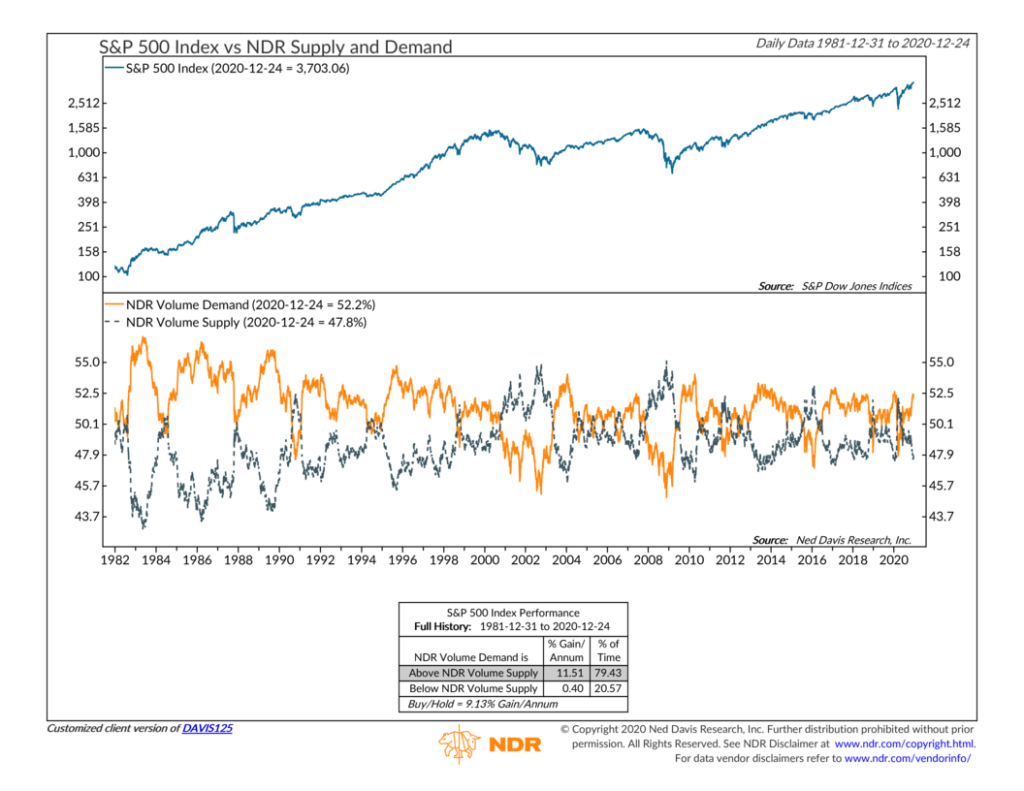
Volume Demand is the total volume in stocks that are rising, and Volume Supply is the total volume in stocks that are declining. Historically, when Volume Demand is higher than Volume Supply, it suggests that investors are excited about the market, and stocks have had a higher annual gain as a result.
This measure of demand for stocks is currently about 52%, which is much higher than the 48% reading for supply. This is good for potential stock market returns, at least in the short run.
But now for something bad. Historically, we find that the proportion of household financial assets invested in stocks moves in a cycle that roughly mirrors the stock market’s performance.
Over time, high stock holdings tend to occur around market peaks, and low stock holdings tend to happen around market bottoms, as shown in the chart below.
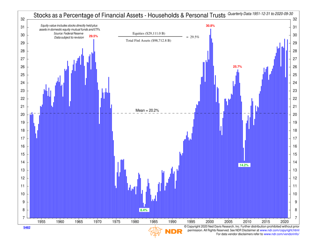
Despite the dip in March earlier this year, the value of equities as a percentage of total financial assets continues to hover around 30%, which is well above the historical average of 20%.
We mainly use this chart to gauge long-term investor sentiment and liquidity. It’s useful for looking at market cycles from a longer-term perspective, but it doesn’t help us much in the short and intermediate term.
For that, we find, much like the first chart, that the weight of the evidence leans to the “something good” side of things. And our models suggest that risk assets, like stocks, remain favorable in this environment at this time.
This is intended for informational purposes only and should not be used as the primary basis for an investment decision. Consult an advisor for your personal situation.
Indices mentioned are unmanaged, do not incur fees, and cannot be invested into directly.
Past performance does not guarantee future results.