OVERVIEW
The U.S. stock market hit a rough patch to start the new year. The S&P 500 fell 1.87%, the Dow declined 0.29%, and the Nasdaq collapsed 4.53%.
Growth stocks took a beating, falling 4.87%, whereas value stocks rose about 0.77% for the week.
This was mostly due to the impressive rise in interest rates last week: the yield on the U.S. 10-year Treasury note rose from 1.51% to 1.77% in just five trading days. Consequently, long-term Treasuries dropped about 4.3%, and intermediate-term Treasuries fell about 1.6%.
Corporate bonds didn’t fare much better. Investment-grade bonds fell 1.93%, and high-yield (junk) bonds declined 0.94%. Inflation-protected Treasuries dropped about 2.3% as real rates rose swiftly off recent lows. Municipal bonds did better but still fell around 0.43% for the week.
Foreign stocks saw more moderate losses. Developed country stocks fell 0.3%, and emerging market stocks fell around 0.48%.
Commodities were a bright spot, however. Overall, they climbed around 2.13% for the week. Oil gained 4.25%, and corn rose about 2.3%. Gold, however, fell 1.68%.
Bringing up the rear was real estate, which dropped about 4.3%. The dollar, on the other hand, strengthened moderately by about 0.12%.
KEY CONSIDERATIONS
Tape Talk – Today I want to talk about “the tape,” or what we call the price movement of stock prices themselves.
Why do we sometimes refer to stock price movements as the tape? Because up until the 1960s, stock prices were transmitted over telegraph lines on ticker tape, and investors would pore over these ribbons of paper to find trends in the data. By the ‘60s, computers had replaced the ticker tape, but the term still pops up in our vernacular from time to time.
The tape is a crucial component of our investment modeling process. Sure, we look at external factors like investment sentiment/behavior and the economic environment, but price movements are roughly equal in importance as these other two factors combined.
In other words, price matters a lot. And, for the most part, we like to invest in accordance with significant price trends.
Heading into the new year, as we look at the three major areas of the stock market, we find that both external factors (investment behavior and the economic environment) are in neutral territory. The tape, however, is positive.
This is important because the tape has been mostly positive since the second quarter of 2020. And since we place so much importance on price movements, we have been able to take advantage of the major bull run that occurred during that time.
To illustrate what I mean, I’ll show a simplified version of a price-based indicator that we use in our analysis. This indicator takes the average price of the S&P 500 index over the past 50 days and divides it by the average price over the past 200 days. This produces a ratio, which is the gold line on the chart below.
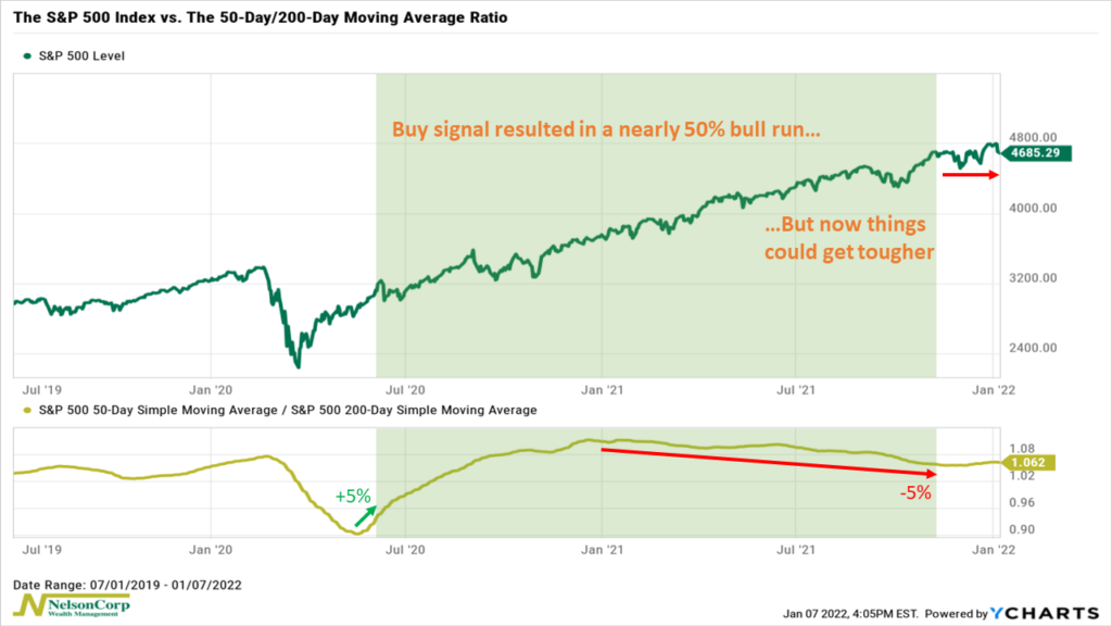
Why do we do this? Because we want to try and measure the intermediate-term trend of the stock market while ignoring the short-term noise or wiggles that happen on a daily basis.
Fifty days is a little more than two months of trading, so we can think of it as the short-term trend. Two hundred days is roughly nine and a half months, so it is more like the intermediate- or long-term trend. When the ratio between the two is rising, it generally means that the average price in the short-term is increasing at a faster rate than the average longer-term trend.
Typically, this occurs when the stock market is trending upwards.
5% is the key number we are looking for here. When the ratio between the short- and long-term trend (gold line) rises by at least 5% from a trough, it triggers a buy signal.
As the chart points out, this last happened around the second quarter of 2020, and it kicked off a massive run for the S&P 500 that saw the index gain nearly 50% in the span of about a year and a half.
However, this signal expired a couple of months ago when the ratio fell roughly 5% from the peak it reached around the beginning of last year. Historically, gains have been harder to come by after the trend has reached this level of exhaustion. Indeed, as you can see on the chart, the S&P 500 index is currently trading near the same level as a couple of months ago when the buy signal expired.
(An interesting side note: You can see how quickly the ratio rose 5% from its trough, triggering a buy signal, versus how long it took for it to fall 5% from its peak—a sign of just how strong this bull run has been).
So all this means that 2022 will be a critical juncture for the current bull market.
It does appear that the ratio has stopped falling and may be just ever so slightly starting to rise again. This will be a good sign for the market if it continues, as it would mean the bull run might still have some legs.
However, suppose the ratio does continue to fall. In that case, the math of the indicator will eventually catch up to the market, and the overall trend in stock prices would inevitably start to head lower as the downward pressure from the shorter-term trend overwhelms the longer-term trend.
At that point, we would look for confirmation from our other indicators to determine if the tape had truly reached a point where the risk-return trade-off in stocks was no longer worth it.
This is intended for informational purposes only and should not be used as the primary basis for an investment decision. Consult an advisor for your personal situation.
Indices mentioned are unmanaged, do not incur fees, and cannot be invested into directly.
Past performance does not guarantee future results.