If you’ve been following market headlines lately, you’ve probably seen a wave of concern over rising interest rates. The U.S. 10-year Treasury yield has been described as flashing warning signs, shaking Wall Street, and even “barfing.” Some investors are bracing for impact. But take a step back, and the picture looks… pretty familiar. In fact, it might just be what a normal bond market looks like.
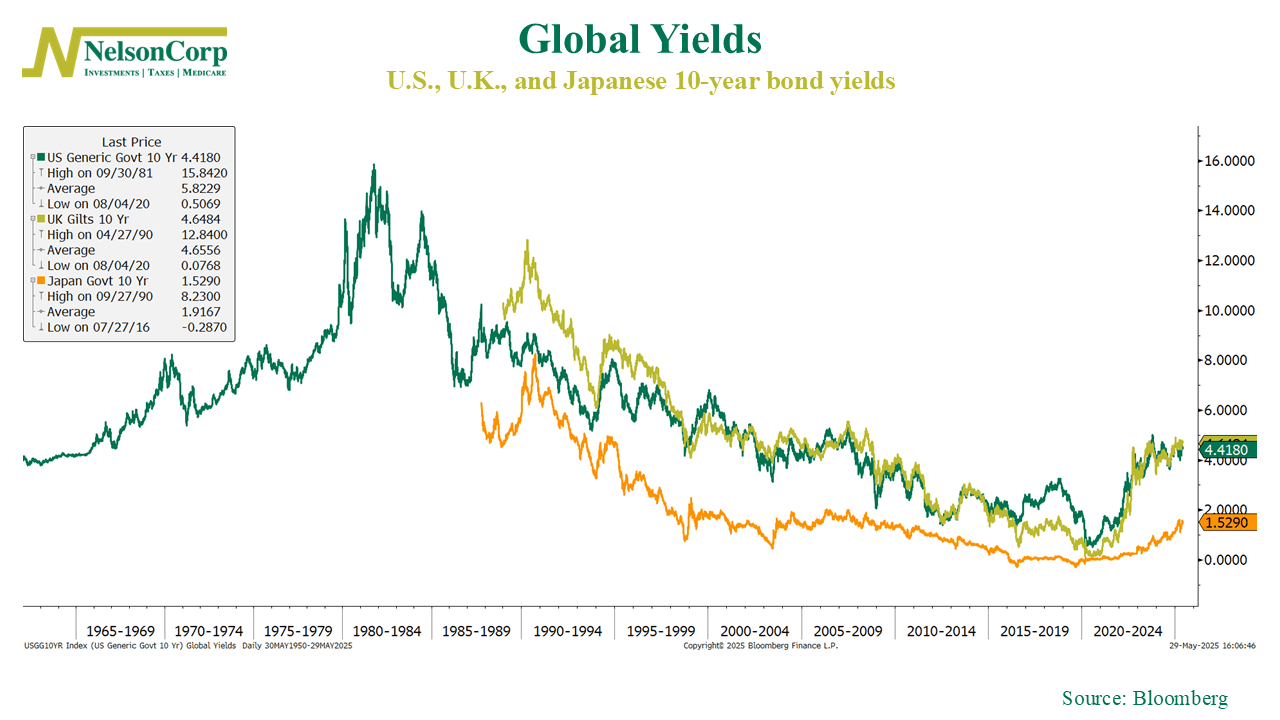
This week’s chart tracks 10-year government bond yields in the U.S. (green), U.K. (gold), and Japan (orange). All three have moved higher this year, reflecting a mix of sticky inflation, persistent deficits, and reduced demand for long-term government debt. But here’s some perspective: the U.S. 10-year yield, currently around 4.4%, is still below its long-term average of 5.8% going back to the 1950s. Even if you take out the sky-high years of the early ’80s, the average is still above 5%. In other words, we’re not in uncharted territory—we’re somewhere near the middle of the historical range.
So why does it feel like something’s off? Maybe it’s just that the past decade rewired our expectations. Rates were held down for so long that anything above 4% feels extreme. We’ve spent more than a decade in a low-rate world, and now we’re adjusting to something that looks more like the long-run average. That adjustment can be bumpy, and it’s fair to be cautious. But if there’s a message in the chart, it’s this: higher yields don’t necessarily mean something’s wrong. Sometimes, they just mean we’re back to something more typical.
This is intended for informational purposes only and should not be used as the primary basis for an investment decision. Consult an advisor for your personal situation.
Indices mentioned are unmanaged, do not incur fees, and cannot be invested into directly.
Past performance does not guarantee future results.