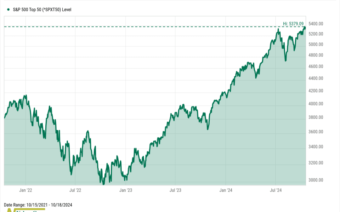
by NelsonCorp Wealth Management | Oct 18, 2024 | Chart of the Week
This week’s chart shows that the biggest and best of the stock market are breaking out to all-time highs. The index, shown above, is the S&P 500 Top 50 Index. It’s a subset of the broader S&P 500 Index, focusing on the 50 largest companies by market...
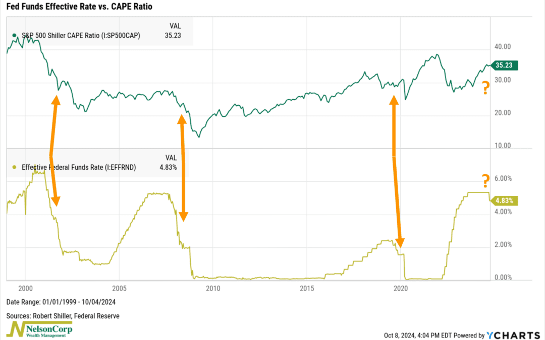
by NelsonCorp Wealth Management | Oct 11, 2024 | Chart of the Week
This week’s chart highlights a key connection between the Fed Funds Rate and stock market valuations, as measured by the CAPE ratio. But first, some definitions. The Fed Funds Rate is controlled by the Federal Reserve and influences all other interest rates....
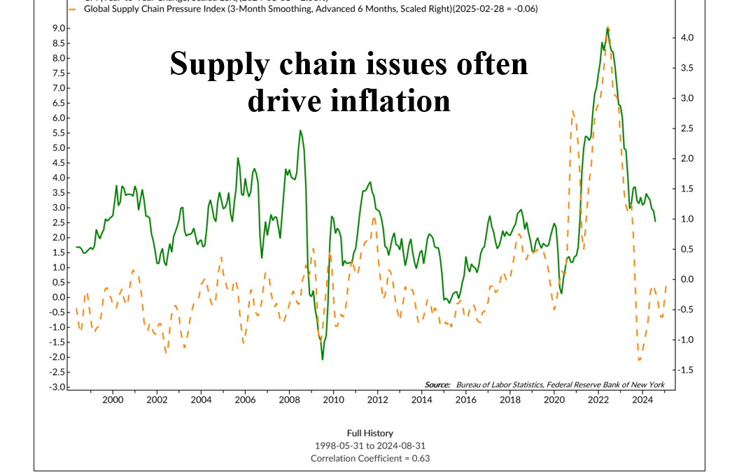
by NelsonCorp Wealth Management | Oct 4, 2024 | Chart of the Week
This week, attention was on the East Coast dockworkers’ strike, which threatened to disrupt supply chains and push inflation higher. Fortunately, a deal was made on Thursday, avoiding what could have been a major issue. I bring this up because this event...
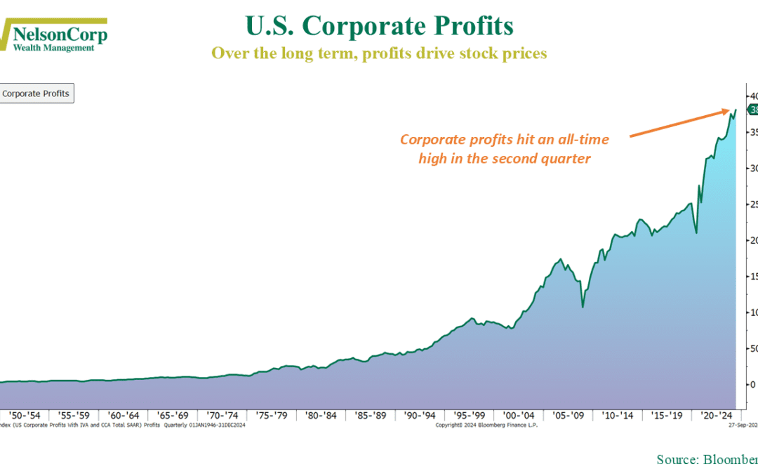
by NelsonCorp Wealth Management | Sep 27, 2024 | Chart of the Week
Have you ever wondered what makes stocks go up? The secret sauce is simple: profits. Over the long haul, it’s all about how much money companies are making. When earnings rise, stock prices tend to follow—like a market version of Newton’s law. What...

by NelsonCorp Wealth Management | Sep 20, 2024 | Chart of the Week
In the world of finance, two key interest rates reign supreme: the 10-year Treasury yield and the Fed Funds rate. The Fed Funds rate is set by the Federal Reserve, and changes to this rate are designed to influence the 10-year Treasury yield—a market-based...

by NelsonCorp Wealth Management | Sep 13, 2024 | Chart of the Week
Fast or slow? When it comes to rate cuts, this week’s featured chart suggests that slower is better. The chart shows how the S&P 500 has historically responded to different rate-cut speeds. There have been eight “slow cycles” where the Fed...