OVERVIEW
The U.S. stock market snapped a three-week losing streak on a holiday-shortened week last week.
The S&P 500 gained 3.65%, the Dow Jones Industrial Average rose 2.66%, and the Nasdaq Composite popped 4.14%.
Growth stocks led the way, gaining 4.11%. But value stocks weren’t far behind, rising 3.68% for the week.
Foreign stocks, however, were mixed. While developed country stocks rose 0.84%, emerging markets fell about 0.18%.
Bonds a had poor week as the 10-year Treasury yield rose to 3.3%, up from 3.2% the week before. Medium-term Treasuries lost 0.73%, and long-term Treasuries declined 1.8%. While investment-grade corporates dropped 0.42%, high-yield (junk) bonds rose about 1.3%. Municipal bonds fell 0.15%, and TIPS lost 1.05% for the week.
Real estate had a strong week, up 4.28%. But commodities traded lower, down 0.46% broadly. This was mostly due to oil, down 0.46%. Gold rose 0.35%, and corn increased 2.89%. The U.S. dollar took a breather and weakened about 0.65% for the week.
KEY CONSIDERATIONS
Head, Shoulders — Knees and Toes? – The S&P 500 index did something interesting over the past few weeks. It formed what is called a head and shoulders pattern.
The head and shoulders pattern is a classic tool used in technical analysis to determine when a market reversal might be forming. Visually, the chart pattern looks like its name: a head and two shoulders.
The point of the pattern is to provide a measuring objective for a price move once the neckline is broken. In other words, it tells us what sort of price decline to expect after a market reversal.
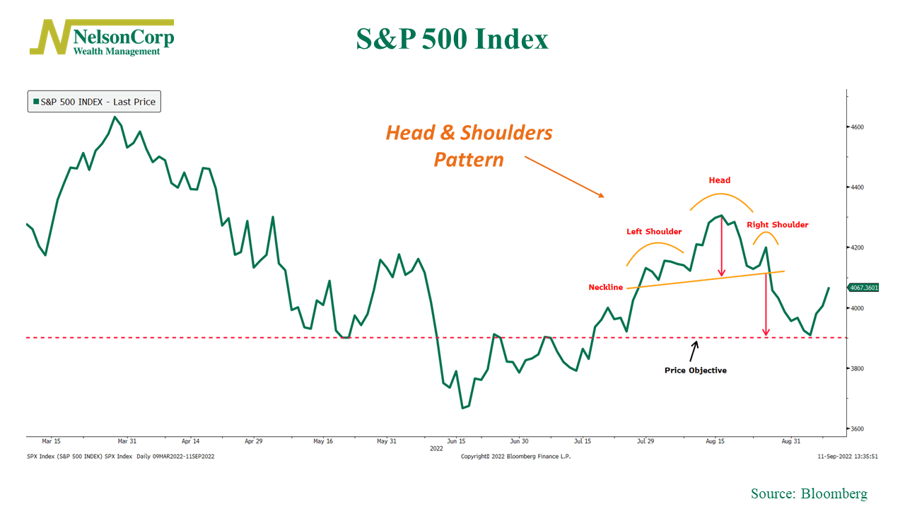
As you can see on the chart above, once the S&P 500 broke below the neckline after forming the right shoulder, it went on to decline to the price objective—which was roughly 3900 on the S&P 500.
However, the interesting thing is that the market bounced once it hit the price objective. The next key level to watch is the right shoulder when this occurs. In general, a downward trend will likely continue unless the right shoulder is broken (i.e., prices move higher than the prices at the peak of the right shoulder).
In other words, sticking with the anatomical metaphor, unless the market can prove itself, it’s not out of the question that we go on to see the knees and toes from here.
But, with that said, it does appear that the market has made a potential higher low. The 3900 level appears to now be a level of support after being a level of resistance back in June. We’ll be looking to see whether the market can go on to make a higher high from here.
So that’s a little fun with the technicals. This type of analysis is not a specific input we use in our modeling process, but it does help provide context around the current price environment. Plus, we place a lot of weight on what the market is doing—the price movement—so it’s a useful thing to be aware of.
Speaking of price movements, our Price Movement model has really deteriorated in recent weeks. In fact, as you can see on the chart below, it recently dropped to zero, its lowest reading since the Great Financial Crisis in 2008.
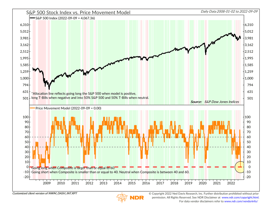
The bottom line? This is a pretty negative place to be as far as the model is concerned. So we will need to see a solid amount of market improvement before our price-based indicators can signal that a potential new uptrend has formed.
This is intended for informational purposes only and should not be used as the primary basis for an investment decision. Consult an advisor for your personal situation.
Indices mentioned are unmanaged, do not incur fees, and cannot be invested into directly.
Past performance does not guarantee future results.