OVERVIEW
The major U.S. stock market indices ended the week down over 4% after Fed Chair Jerome Powell delivered a hawkish speech at the Jackson Hole event on Friday. The S&P 500 Index fell 4.04%, the Dow Jones Industrial Average dropped 4.22%, and the Nasdaq Composite decreased 4.44%.
Growth stocks led the declines in the U.S. market, falling 4.43%, versus the 3.17% decline in value stocks. Large-cap stocks dropped 4.37%, and small-cap stocks declined 3.37%.
Foreign stock markets, however, saw mixed performance for the week. The MSCI EAFE Index of developed country stocks fell 1.84%, whereas emerging markets rose 0.5%.
Bond prices were also mixed, with long-term Treasuries gaining about 0.45% but intermediate-term Treasuries declining roughly 0.17%. High-yield bonds, which correlate with equity returns, fell over 1% for the week. Investment-grade corporate bonds, however, only declined about 0.23%. Municipal bonds dropped 0.67%, and TIPS gained 0.12%.
Commodities had a strong week, rising around 1.86% broadly. Specifically, oil rose 2.42%, and corn gained 6.58%, whereas gold fell about 0.74%. The U.S. dollar continued to strengthen, gaining about 0.69% to end the week.
KEY CONSIDERATIONS
More Work to Be Done – Fed Chair Jerome Powell’s speech last Friday at the Jackson Hole conference in Wyoming was short—and hawkish. Powell reiterated the Fed’s intention to bring the proverbial hammer down on inflation, even if that means temporary pain for the U.S. economy.
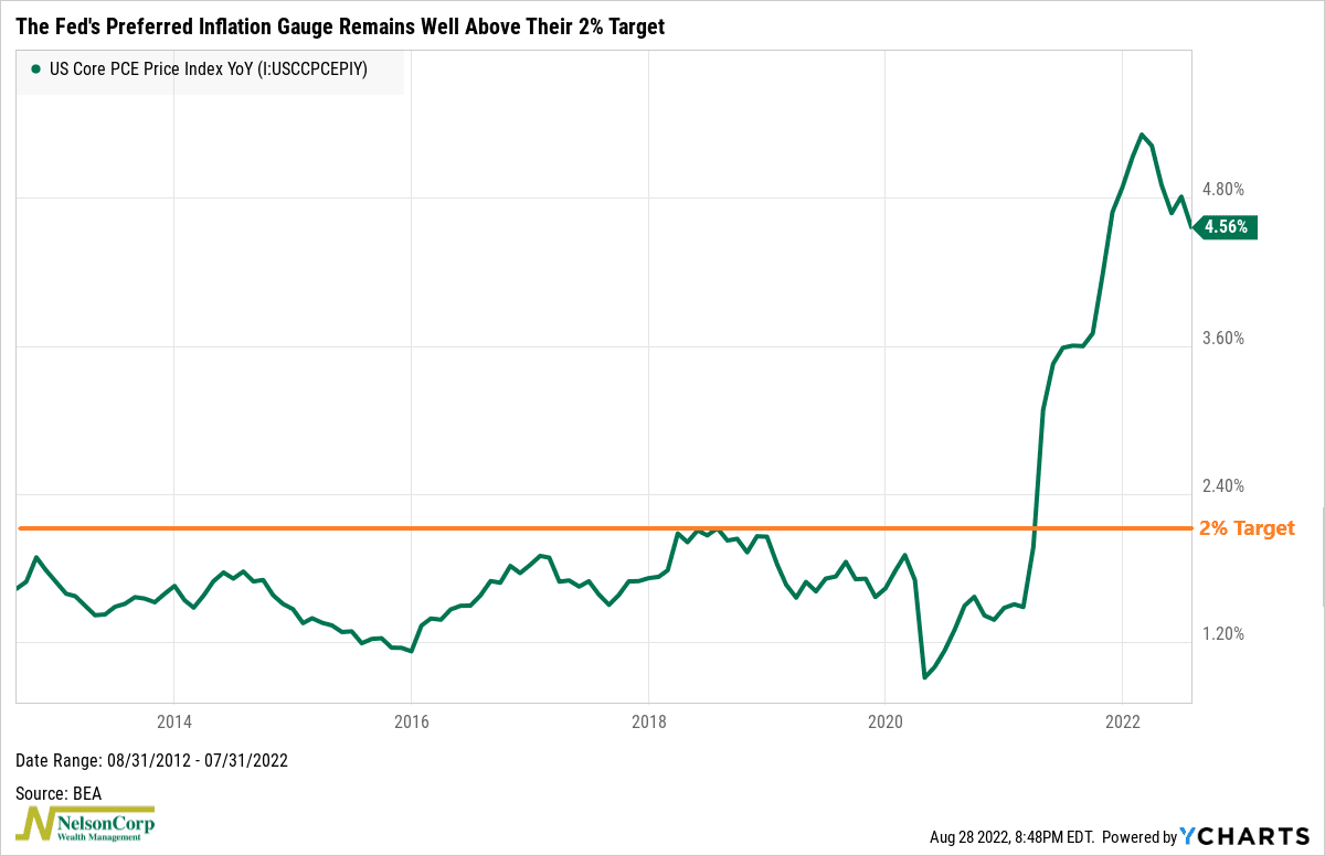
Powell acknowledged that despite last month’s improvement in the Consumer Price Index—a widely followed gauge of inflation—a single month’s improvement still falls far short of what the committee needs to see before they can be confident that inflation is coming down.
In other words, as Powell made clear, there is more work to be done.
For example, on Friday, we learned that the Core PCE Price Index—the Fed’s preferred measure of inflation—was up 4.56% in July from a year ago. Sure, this is down from the 4.8% rate in June and the 5.3% peak in February, but it’s well above the Fed’s 2% target rate.
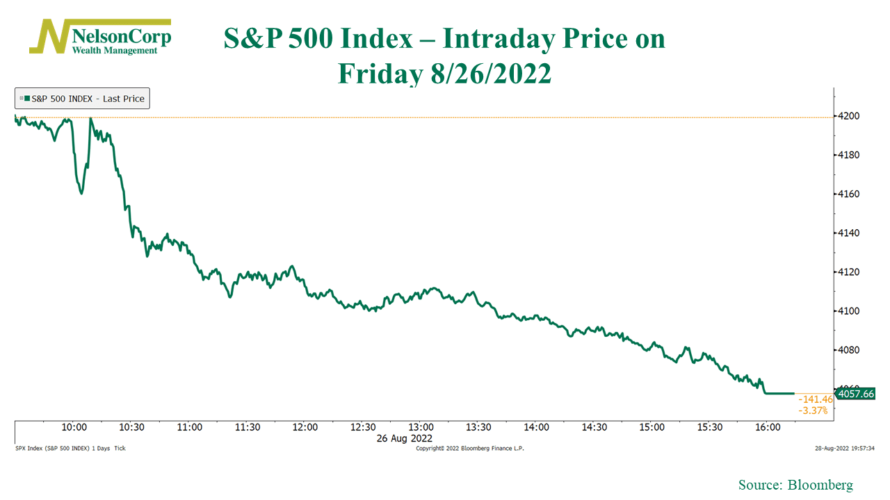
So how did the market react to Powell’s speech? Short answer: not good.
Here’s an intraday chart of the S&P 500 Index on Friday. It was volatile near the beginning, but eventually, the market got the hawkish message and sold off aggressively. It ended the day down 3.37%.
As for the bond market, yield moves were more muted. However, the more significant development is what we’ve seen play out over the past month regarding the 10-year minus 3-month Treasury yield curve.
About a month ago, we pointed out that due to the Fed aggressively hiking rates at the short end of the yield curve, we would likely see the spread between the 10-year Treasury rate and the 3-month Treasury yield compress to under 60 basis points—or perhaps even go negative.
Indeed, as the chart below shows, the spread has dropped far enough that one of our yield curve spread indicators is currently in a hostile zone for stock returns relative to both bonds and cash.
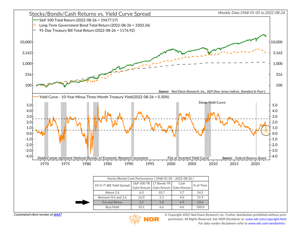
This is significant because negative readings from these types of economic indicators are weighing down the economic segment of our stock market risk model. And the yield curve isn’t the only culprit either. Indicators that track interest rates, credit spreads, financial liquidity, and inflation are all flashing negative signs right now.
Why is this an issue? Because it means that the other components of the model—like the indicators that track price movements—must get more bullish than usual before the weight of the evidence can tilt more positive.
To be sure, we did see a significant amount of improvement in the price movement component of our model after the stock market’s recent rally off the mid-June low. But it hasn’t been enough.
For example, I’ll end by showing a tool we use to measure volume demand and supply in the stock market.
Shown on the chart below, this indicator looks at the total volume of money traded in advancing stocks (volume demand, orange line) versus the total volume of money traded in declining stocks (volume supply, blue line).
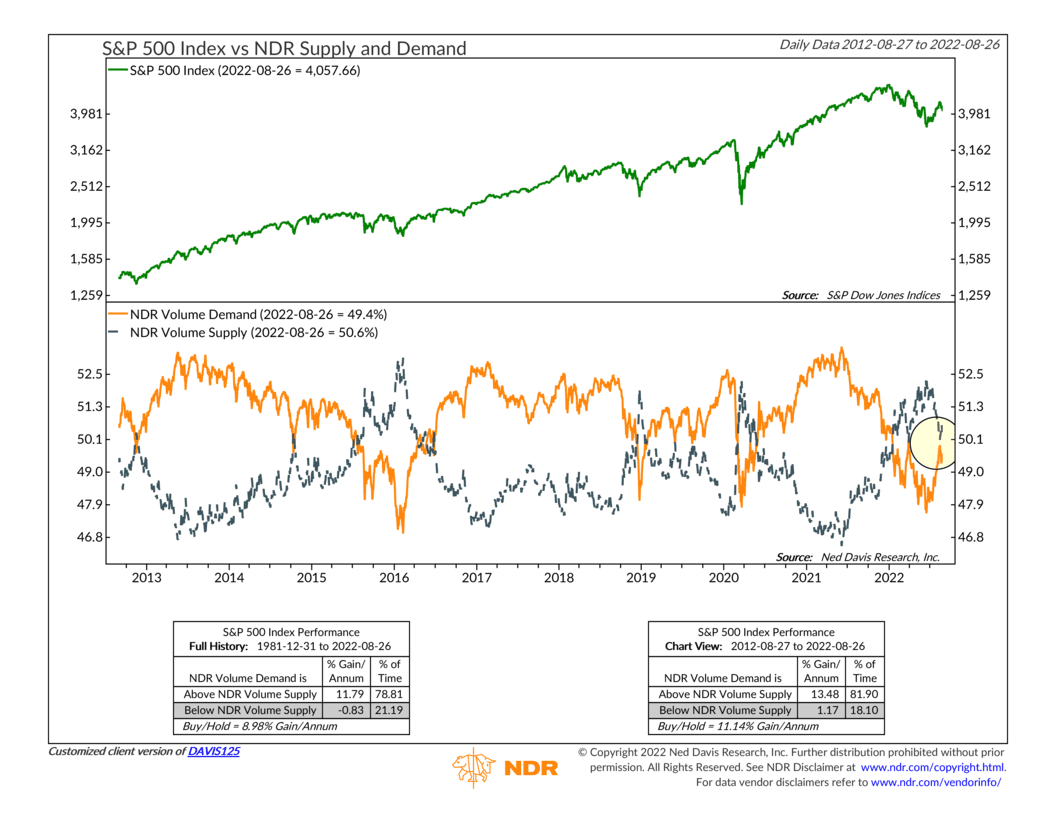
When volume demand is higher than volume supply, it’s a sign that investors are enthusiastic about stocks—and vice versa when volume supply is greater than volume demand.
As I’ve highlighted on the chart, volume demand recently came really close to surpassing volume supply for the first time since January. But it failed. And so did the stock market rally. A positive reading from this indicator certainly would have helped give the rally some legs.
So, to wrap up, the key takeaway is that this remains a challenging environment for risk assets—like stocks. There remains a lot of uncertainty around monetary policy, as evidenced by the market’s reaction to Jerome Powell’s speech. And the overall environment of high inflation and high interest rates continues to weigh on investors’ willingness to pay up for stocks.
This is intended for informational purposes only and should not be used as the primary basis for an investment decision. Consult an advisor for your personal situation.
Indices mentioned are unmanaged, do not incur fees, and cannot be invested into directly.
Past performance does not guarantee future results.