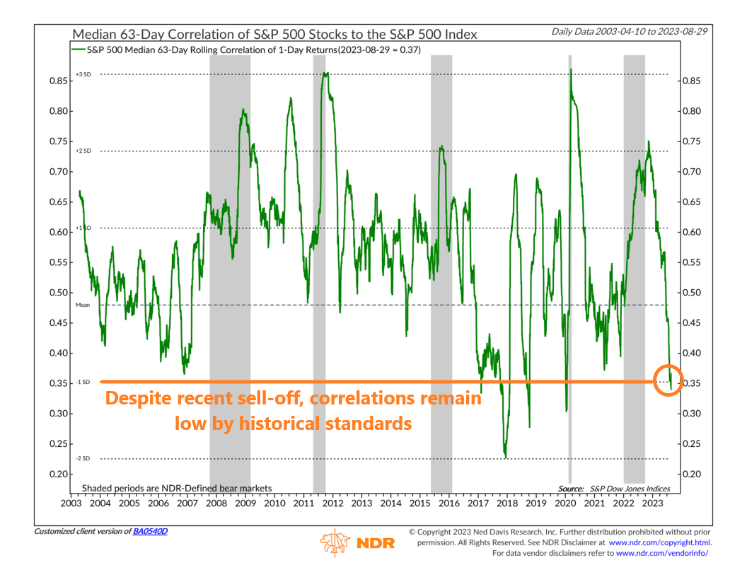
This week, we have a neat little chart that shows how much “correlation” there is in the stock market. Correlation, as applied in this case, is a statistical metric that measures how much the average stock is moving in relation to the rest of the stock market. The higher the number (closer to 1), the higher the correlation, meaning stocks are moving more in tandem and vice versa.
For example, the chart above specifically looks at the average S&P 500 stock’s rolling 3-month correlation with the S&P 500 itself. Currently, the correlation is just 0.37. That’s pretty low by historical standards—roughly one standard deviation below the mean, to be exact. In other words, stocks aren’t exactly moving together in a unified fashion.
Why is this important? Because, generally, correlations are driven by fear. During times of market stress, you see investors sell stocks indiscriminately, which drives the correlation metric higher.
But, despite the recent sell-off, the increase in the 3-month realized correlation for the S&P 500 has been relatively minor so far. In fact, looking at the chart, the correlation has dropped pretty dramatically this year. As long as we don’t see a spike in correlations, it should continue to be a positive sign for stocks.
This is intended for informational purposes only and should not be used as the primary basis for an investment decision. Consult an advisor for your personal situation.
Indices mentioned are unmanaged, do not incur fees, and cannot be invested into directly.
Past performance does not guarantee future results.