Volume—or the number of shares traded in the stock market—is an important metric for financial markets.
We look at volume because, in general, when a rising stock has a lot of volume, it’s a sign of strength. But when the stock is falling on a lot of volume, it tends to be a sign of weakness.
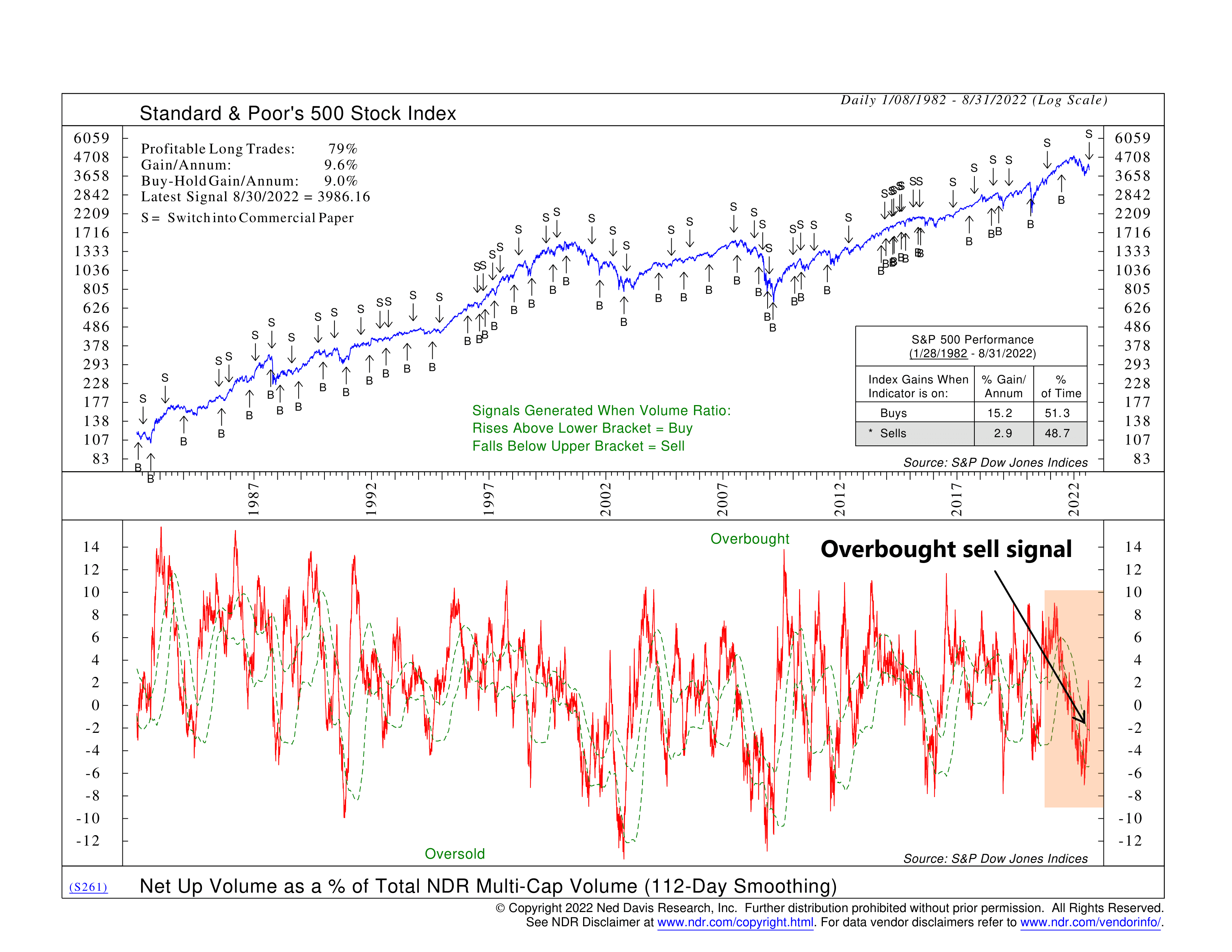
However, the point of this week’s featured indicator is that there comes a point at which, as far as volume is concerned, you can have too much of a good thing. That’s because the market can get overbought or oversold when there is too much enthusiasm one way or another.
The indicator is based on the concept of net up volume. To find net up volume, we start by subtracting the volume in stocks that closed lower on the day from the volume in stocks that closed higher for the day. This gives us the net up volume figure, which is then smoothed or averaged by 112 trading days. We then find the total volume traded in all stocks, which also gets smoothed. And finally, we take the ratio of the smoothed net up volume to the smoothed total volume.
We call that final calculation net up volume as a percentage of total volume. That’s our indicator. It’s shown as the red line on the bottom clip of the chart. You might also notice that it is sandwiched by two green dashed lines. These key levels signify when the indicator is in overbought territory (upper line) or oversold territory (lower line).
We’ve found that when the indicator rises above the upper band, the demand for stocks is excessive and likely to be followed by a period of declining demand. In other words, the market got overbought. A sell signal is produced once it falls below the upper band. This jibes with our philosophy to go with the flow until it reaches an extreme and reverses.
The same works in reverse, too. A buy signal is generated when the indicator falls below the lower band and reverses. The sellers have likely exhausted themselves, and the worst of the selling is over. Stated differently, the market got oversold and is thus ripe for a rally.
Historically, with data going back to 1982, this indicator has produced profitable long trades about 79% of the time. The gain per year from this strategy is about 9.6%, on average. This compares to a buy-and-hold gain of 9% for the S&P 500 Index.
Recently, the indicator triggered a sell signal. You can see how net up volume as a percentage of total volume was declining throughout the year. Then there was a spike into overbought territory during the mid-summer rally. However, the upside volume lost its steam, and the indicator reversed below the upper bracket, triggering a sell signal.
This type of indicator is helpful because it allows us to paint a broader picture of the market’s price action using metrics other than just price. Volume helps us determine how enthusiastic a price move is and whether that enthusiasm has gone too far.
The recent sell signal from this indicator tells us that we likely got too much of a good thing from the recent rally. The reversal in net up volume signifies that the sellers have taken control from the buyers and are, once again, pushing the broader market lower.
This is intended for informational purposes only and should not be used as the primary basis for an investment decision. Consult an advisor for your personal situation.
Indices mentioned are unmanaged, do not incur fees, and cannot be invested into directly.
Past performance does not guarantee future results.